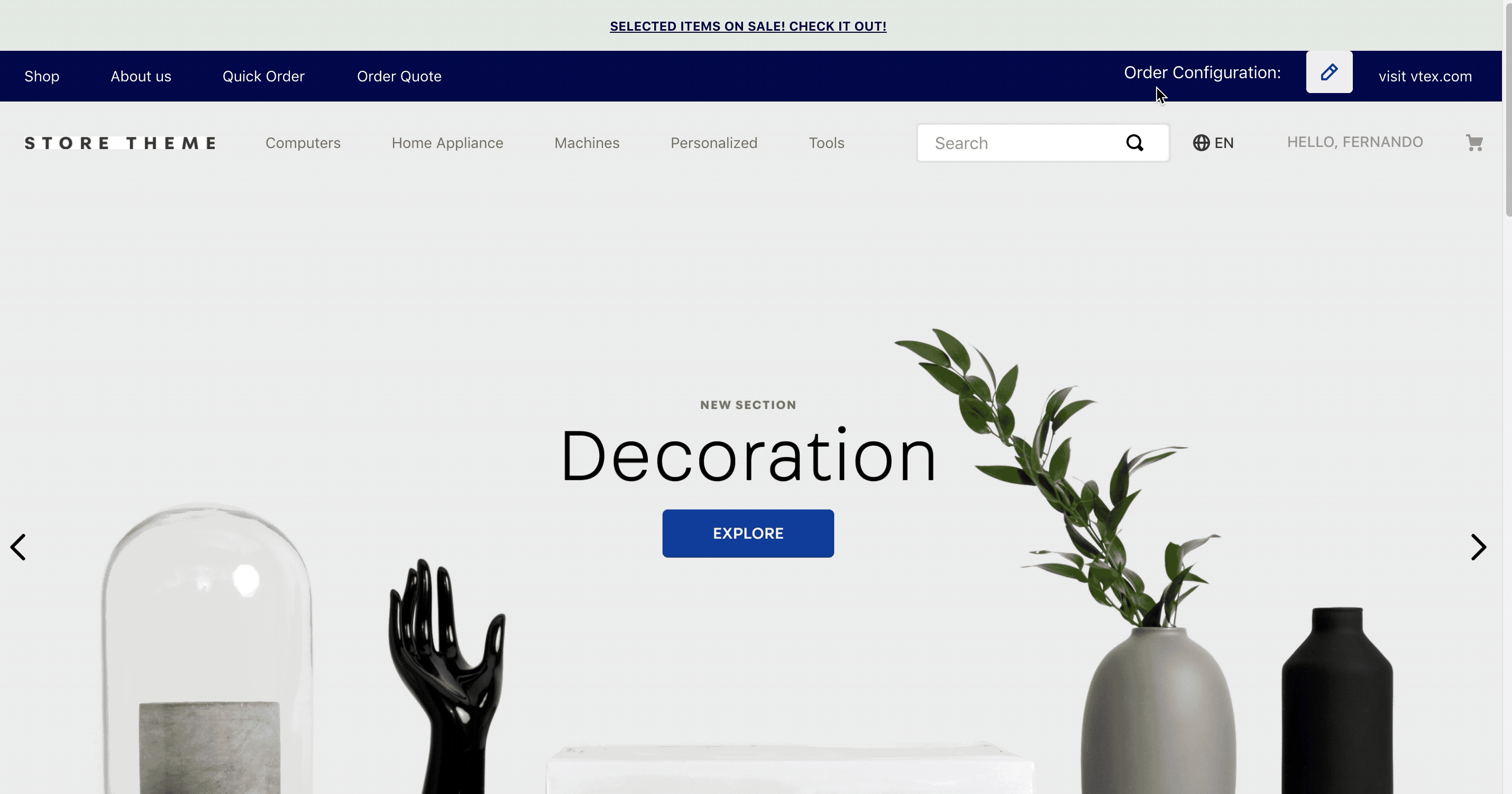
The Order Configuration app, designed for B2B scenarios, displays a form responsible for collecting order data in a modal.
Once the form is submitted, the order data collected will be available at MasterData and saved in the current VTEX session.
:information_source: This app can be used to customize all kinds of behaviours, such as custom prices, custom products, etc. Keep in mind that this app does not offer such functionality, but enables these other apps to do so.
Configuration
Step 1: Add the order-configuration app to your theme's dependencies in the manifest.json file:
dependencies: {
+ "vtex.order-configuration": "0.x"
}
Now, you are able to use the blocks exported by the order-configuration app. Check out the full list below:
| Block name | Description |
|---|---|
order-config | Parent block only responsible for rendering its children blocks (that in turn build the Order Configuration component). |
order-config.title | Renders the component title i.e. the message text displayed for users to present the component. On the gif above, the component title is Order Configuration:. |
order-config.modal | Renders the modal responsible for displaying the component content. |
order-config.form | Renders the component content (a form to be filled out by users). |
Step 2: Add the order-config block in the Header component. For example:
{
  "header-layout.desktop": {
    "children": [
      "flex-layout.row#1-desktop",
      "flex-layout.row#2-desktop",
      "flex-layout.row#3-desktop",
      "sticky-layout#4-desktop"
    ]
  },
  "flex-layout.row#3-desktop": {
    "props": {
      "blockClass": "menu-link",
      "horizontalAlign": "center",
      "preventHorizontalStretch": true,
      "preventVerticalStretch": true,
      "fullWidth": true
    },
    "children": [
      "vtex.menu@2.x:menu#websites",
      "flex-layout.col#spacer",
+     "order-config#header",
      "vtex.menu@2.x:menu#institutional"
    ]
  },
Step 3: Declare the order-config#header block and its children blocks: order-config.title and order-config.modal. For example:
{
  "order-config#header": {
    "children": [
      "order-config.title#header",
      "order-config.modal#header"
    ],
    "props": {
      "blockClass": "header",
      "formFields": [
        {
          "name": "orderType",
          "type": "string",
          "fieldType": "radio",
          "label": "Order Type",
          "defaultValue": "resale",
          "options": [
            {
              "label": "Resale",
              "value": "resale"
            },
            {
              "label": "Consumption",
              "value": "consumption"
            }
          ]
        },
        {
          "name": "state",
          "type": "string",
          "fieldType": "select",
          "label": "State",
          "showInTitle": true,
          "options": [
            {
              "label": "ES",
              "value": "ES"
            },
            {
              "label": "SP",
              "value": "SP"
            }
          ]
        }
      ]
    }
  },
  "order-config.modal#header": {
    "children": [
      "order-config.form"
    ]
  },
  "order-config.title#header": {
    "props": {
      "formTitle": "Order Configuration for Header"
    }
  },
}
:information_source: If the order-config.form block does not have any children configured, a default form will be rendered automatically based on the React Hook Form JSON Schema library. To declare children blocks according to your business needs, check out the Advanced section below.
Step 4. Create a Schema named main at MasterData
This step is required. The data entity used has to be order_configuration and the name of the schema has to be main. The schema should contain all the data that you added in the form above, otherwise the data will not be persisted.
An example of schema to be persisted at MasterData, that is consistent with the data collected above:
Request: PUT to http://<your store>.vtexcommercestable.com.br/api/dataentities/order_configuration/schemas/main
Body:
{
    "v-cache": false,
    "properties": {
        "clientId": {
            "type": "string"
        },
        "orderType": {
            "type": "string"
        },
        "state": {
            "type": "string"
        }
    },
    "v-default-fields": [
        "clientId",
        "orderType",
        "state"
    ],
    "v-indexed": [
        "clientId",
        "orderType",
        "state"
    ]
}
Refer to MasterData documentation for more details.
Advanced configuration
If desired, you can declare the order-config.form block by adding and configuring the formFields prop and an array of form children blocks (whose descriptions you can find below).
{
  "order-config#static-page": {
    "props": {
      "formFields": [
        {
          "name": "orderType",
          "type": "string",
          "fieldType": "select",
          "label": "Order Type",
          "defaultValue": "res",
          "showInTitle": true,
          "options": [
            {
              "label": "Resale",
              "value": "res"
            },
            {
              "label": "Consumption",
              "value": "cons"
            }
          ]
        },
        {
          "name": "state",
          "type": "string",
          "fieldType": "select",
          "label": "State",
          "showInTitle": true,
          "required": true,
          "options": [
            {
              "label": "ES",
              "value": "ES"
            },
            {
              "label": "SP",
              "value": "SP"
            }
          ]
        },
        {
          "name": "someTextInput",
          "label": "Some Text Input",
          "fieldType": "input",
          "type": "string",
          "required": true,
          "showInTitle": true
        }
      ]
    },
    "children": [
      "order-config.title#static-page",
      "order-config.form#static-page"
    ]
  },
  "order-config.form#static-page": {
    "children": [
      "flex-layout.row#state-and-payment-method",
      "order-config.text#some-text-input",
      "order-config.submit"
    ]
  },
  "flex-layout.row#state-and-payment-method": {
    "children": [
      "order-config.dropdown#state",
      "order-config.radiogroup#payment-method"
    ],
    "props": {
      "blockClass": "stateAndPaymentMethod"
    }
  },
  "order-config.dropdown#state": {
    "props": {
      "pointer": "#/properties/state"
    }
  },
  "order-config.radiogroup#payment-method": {
    "props": {
      "pointer": "#/properties/paymentMethod"
    }
  },
  "order-config.text#some-text-input": {
    "props": {
      "pointer": "#/properties/someTextInput"
    }
  },
  "order-config.title#static-page": {
    "props": {
      "formTitle": "Order Configuration for Static Page"
    }
  }
}
| Block name | Description |
|---|---|
order-config.submit | Renders a Submit button. |
order-config.dropdown | Renders the a dropdown field. |
order-config.radiogroup | Renders a radiogroup field. |
order-config.text | Renders a text field. |
order-config.textarea | Renders a text field with a wider range of available characters. |
order-config.checkbox | Renders a checkbox field. |
order-config.dropdown, order-config.radiogroup, order-config.text, order-config.textarea, and order-config.checkbox prop
| Prop name | Type | Description | Default Value |
|---|---|---|---|
pointer | string | Path to which the block must point in the formFields prop in order to properly work. | undefined |
order-config.form prop
| Prop name | Type | Description | Default Value |
|---|---|---|---|
formFields | object | Object responsible for defining the form fields. | undefined |
formFieldsobject:
| Prop name | Type | Description | Default Value |
|---|---|---|---|
name | string | Name of the field (only used as an identifier in your code). | undefined |
type | enum | Value type accepted by the field. Possible values are string and number. | string |
fieldType | enum | Input type accepted by the field. Possible values are: text, textarea, select, radio, and checkbox. | text |
label | string | Field name shown to users. | undefined |
showInTitle | boolean | Whether to display the value type accepted by the field on its name (true) or not (false). | false |
options | object | Field options to be defined in case select, radio, or checkbox values were declared in the fieldType prop. | undefined |
optionsobject:
| Prop name | Type | Description | Default Value |
|---|---|---|---|
label | string | Option name shown to users. | undefined |
value | string | Option value. | undefined |
Customization
In order to apply CSS customizations in this and other blocks, follow the instructions given in the recipe on Using CSS Handles for store customization.
| CSS Handles |
|---|
formSubmitButton |
formSubmitContainer |
formErrorServer |
formErrorUserInput |
loader |
orderConfigFormWrapper |
formObject |
title |
titleValues |
titleWrapper |
wrapper |