With the app template already copied, we will now create a new theme block. Follow the instructions below to create the new theme block.
Before you start
- Before you start creating your storefront component, make sure you are familiar with the VTEX Store Framework and the concepts of blocks, store themes, and templates. If you need a refresher or are not yet familiar with these concepts, we highly recommend checking out the Building storefronts with Store Framework tutorial before proceeding.
- Check our recommended practices for tooling, features, flexibility, scalability, performance, accessibility, internationalization, and styling. For more information, please refer to Best practices for developing custom storefront components.
Understanding interfaces
An interface describes the shape of an object, including its properties and data types. This is crucial for ensuring type safety and preventing potential bugs.
In VTEX Store Framework, interfaces are used to link theme blocks to their corresponding React components. This way, interfaces provide a set of rules that dictate the behavior of theme blocks when rendering their React components and the available properties and methods.
For each theme block exported by your app, you should define a corresponding interface that defines the props available to the React component. The table below lists some possible interface keys that you can add to your block's interface along with their respective descriptions.
| Key | Description |
|---|---|
component | Name of the React component that the theme block will render. |
allowed | List of of other theme blocks that help build the desired React component. When declared, these blocks can be included as children to the block you developed in the Store Theme app. |
composition | Determines the rendering position of the children of the block that you are developing. Possible values for this key are blocks (the child blocks have a specific position in the interface, according to the React component on which they are based) or children (the position of the child blocks depends exclusively on how they are declared in the theme). If no value is defined for the composition key, the default is blocks. |
device | Defines whether your theme block is designed for mobile or desktop devices. Possible values are mobile and desktop. |
required | List of theme blocks that must be rendered in the interface to support the block rendering you are developing. |
around | List of theme blocks that must be rendered in the interface around your new block for its correct functioning. |
before | List of theme blocks that must be rendered in the interface before your block for its correct functioning. For example: header. |
after | List of theme blocks that must be rendered in the interface after your block for its correct functioning. For example: footer. |
preview | Defines the behavior of the page while the block is loaded. |
render | Defines the block's rendering type. Possible values are lazy (the block is only rendered when a user interacts with it), server (the block is rendered from the server side), or client (the block is rendered from the client side, that is, by the browser). |
The only mandatory key that needs to be declared in a block interface is component.
Step by step
Step 1 - Declaring an interface
To add new custom blocks to your VTEX store, you need to declare their interfaces in the interfaces.json file of your app. This file is used by Store Builder during the website building process.
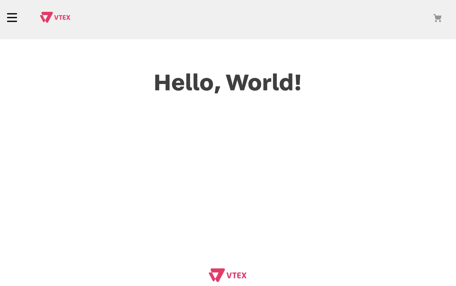
As an example, let's create an interface for a basic block called hello-world. This block will render the React component defined in HelloWorld.tsx.
- Open your app's code (previously called
react-app-template) in your preferred code editor. - In the
reactfolder, create a new TypeScript file with the name of the desired React component. For example,HelloWorld.tsx. - In the newly created file, add the sample code provided below:
import { React } from 'react'
const HelloWorld = () => <div>Hello, World!</div>
export default HelloWorld
Refer to React documentation and Developing custom storefront components guide to learn more about how React components work.
- Create a new folder called
storeon the root level of your app's folders. - In the
storefolder, add a new file calledinterfaces.json. - Declare the block interface in the
interfaces.jsonfile. For example:
{
 "hello-world": {
    "component": "HelloWorld"
  }
}
In this example, note that the first definition in the interface is the name of our new theme block, which is hello-world. Within it, we declare an object that contains the interface keys previously described.
In our example, we only used the component key to link thehello-world block to the React component that it will render, which is HelloWorld. Note that the value of the component key is HelloWorld – the file name that was previously created for the React component (react/HelloWorld.tsx).
To learn more about structuring the
interfaces.jsonfile, check the code of native Store Framework apps such as Search Result and Header. Remember that the way we declare an interface depends directly on the behavior we want for the block.
After saving your code changes, your new block will be ready to be implemented by any user who installs your app.
If the app under development exports more than one theme block, all of these blocks' interfaces must also be declared in the
interfaces.jsonfile, according to the format presented in this section.
Declaring device-specific interfaces
In some cases, you may want your app to export different blocks to render different components depending on the device accessing the store. You can achieve this by creating different blocks for each possible device and defining different interfaces for each one of them
Let's take an example where you are developing the hello-world block and want to create mobile and desktop versions for it. You will have to create the HelloWorld, HelloWorldMobile, and HelloWorldDesktop components, and define interfaces for each one of them, such as hello-world, hello-world.mobile, and hello-world.desktop.
The parent block's interface (hello-world) should contain only the component and allowed keys, with the allowed key declaring the hello-world.mobile and hello-world.desktop blocks.
The interfaces for the mobile and desktop blocks, in turn, should declare the desired keys, for example device, to define the behavior of each block according to the device for which they were designed.
Apps like Header and Footer are good examples that use different React components for different devices.
Step 2 - Using your new theme block
Now, it's time to implement the new block you created in a Store Theme app.
If the Store Theme app for VTEX Store Framework is already installed in your VTEX account, follow the instructions below starting from step 2. If the app is not yet installed, follow the instructions from step 1:
- Read carefully step 3 in the Build stores with Store Framework section and follow the steps detailed in the article. Once you are done, you will have implemented the standard theme for the VTEX Store Framework and will be ready to test your new block.
- Open the Store Theme app folder using the code editor of your choice.
- In the Store Theme
manifest.jsonfile, add the app you are developing as a dependency independencies. For example:
"dependencies": {
+   "{accountName}.{appName}": "{appVersion}",
    "vtex.store": "2.x",
    "vtex.store-header": "2.x",
    "vtex.product-summary": "2.x",
    "vtex.store-footer": "2.x",
    "vtex.store-components": "3.x",
    ...
}
- Then, add the new theme block (
hello-worldin our example) to one of the templates. For this walkthrough, we will add thehello-worldblock to the store's home page, in thestore.hometemplate:
{
  "store.home": {
     "blocks": [
+       "hello-world"
     ]
  },
  ...
}
- Link the store's theme with the VTEX IO platform.
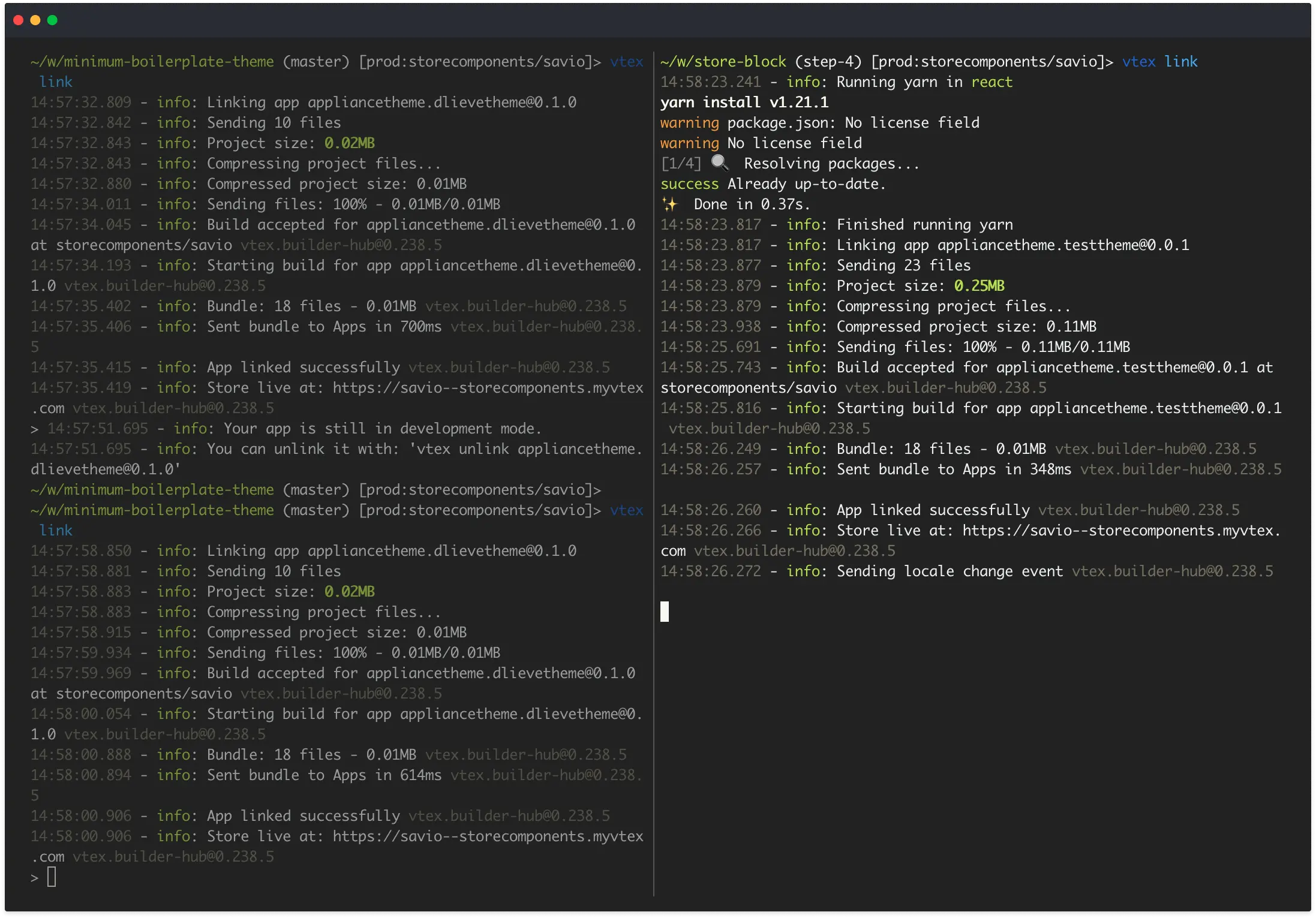
- Access your store using the structure
{workspaceName}-{accountName}.myvtex.comto see your newhello-worldblock being displayed in your development workspace: